Throwing POS signs and banners into the brand mix
To achieve maximum visibility, brands make sure each of their POP materials seamlessly matches the next – and sometimes even literally points to it. Think floor decals in the form of footprints that lead customers straight towards a POP display, or vertical banners attached to the ceiling, pointing downward to the sales area. Shelf talkers, posters, POP displays, … are all printed in perfectly matching brand colours. Ever noticed how even standees are usually wearing clothes in brand colours? Well, there you go.
But there are exceptions, too …
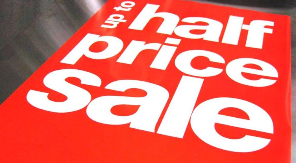
Stop! Purchase time!
There is a reason why stop signs, as well as most sales signs, are red. Whenever POS signs and banners don’t necessarily require brand colours (50% off, 2 for 1, Clearance Sale!) marketeers turn to colour psychology to catch the consumer’s eye. Some tried-and-tested examples:
- Red, orange, black and royal blue are known to attract impulse shoppers and are most successful in sales contexts and fast food businesses.
- Shoppers on a budget are particularly attracted to navy blue and teal, colours which are often used in banks and department stores.
Putting the best font forward
Maximum visibility and readability evidently go hand in hand. When it comes to POS signs and banners, most designers prefer sans serif fonts as the shapes of the letters are more minimal than serif fonts and therefore easier on the eye. But what matters even more is font size. A rule of thumb is that letters have the most impact at a distance ten times their height. Letters that measure 30 centimeters high, for example, have the best impact when they’re read from 3 meters away.
Did you know? To calculate a font size’s maximum readable distance, you need to multiply the height of the letters by 40.
Printing signs and banners the Xeikon way
Equipped with a fifth station for spot colours and able to print one-pass-duplex at 1200 dpi – all POP materials in stores are looked at from up close sooner or later –, the Xeikon 9600 and the Xeikon 9800 are ideal for printing high-quality POS signs and banners. What’s more, they combine extremely high throughput and high-resolution output on a wide range of substrate weights. Good to know: Xeikon’s in-house toner production facility even creates custom spot colours on demand, so you can rest assured your signs and banners will always have the right hue. Thanks to Xeikon, producing entire campaign sets for individual shops with customized product offerings and price settings becomes child’s play!
Want to learn more? Contact us anytime.
Discover more tips to design and print vertical banners.